BoothEconomy · June 23, 2026
A Facebook post comparing four booth layouts — inline, U-shape, L-shape, and island — drew nearly 300 comments from vendors. The U-shape, a layout many assume invites shoppers in, came under the heaviest criticism: vendors and shoppers alike described it as cramped, awkward to pass through, and in one case, physically inaccessible. The strongest case against it didn’t come from a sales metric. It came from a shopper at a farmers market who wondered aloud what someone in a wheelchair would do.
Jake Rose didn’t expect much when he posted four rough diagrams to the Vendors on the Rise Facebook group. “Let’s talk about booth setup,” he wrote, laying out a Classic Inline, a U-Shape, an L-Shape, and an Island layout, each labeled with rough table dimensions and walkway widths. “Which of these is the best or have you tried? How have you set up for good traffic flow and best use of space?” He added a disclaimer that the sketches were “not drawn to scale,” just a rough idea for placement.
That disclaimer turned out to matter. Within the comments, a vendor flagged that the table dimensions in the diagrams didn’t add up. Rose acknowledged the error directly, at one point describing the post as “a quick drawing” and clarifying there was no hidden trick to the math — no, as he put it, magic loophole. The correction thread became its own small debate, a sign that vendors weren’t just reacting to the concept of each layout. They were doing the math themselves.
Where the U-Shape Falls Apart
The U-shape was billed in Rose’s post as the “experience” layout — tables wrapped around three sides, drawing the shopper into a kind of alcove. In practice, vendors who’d tried it described the opposite effect.
Coralise Marie, a vendor who builds and refines her own booth layout event to event, told Booth Economy that she’d tried something close to the U-shape early on: two tables across the middle of her tent, then later two tables down the sides with nothing in the middle. Neither held up. “I noticed with the U shape that as people were inside shopping, others would look and pass by even if they looked super interested,” she said. “There just wasn’t enough room.” She also noticed something more basic: people kept bumping into each other as they came and went.
That observation matches what played out in Rose’s comment section. Several vendors agreed that a tight U discourages entry rather than inviting it — one noted that the shape can make shoppers hesitate at the threshold, and others described switching to an “outer U,” with the seller positioned at the back rather than boxed in by tables on three sides. The Z-layout came up repeatedly in the same vein — vendors citing it as their preferred alternative once the standard U stopped working for them. (See the layout reference below for how each shape actually breaks down.)
Neighbors First, Layout Second
Marie’s current approach isn’t a fixed layout at all — it’s a decision tree. “I usually first take into account if I have neighbors,” she said. “That’s usually the major factor on the type of layout I do.” Depending on what’s set up next to her, she’ll run an outer L or a straight line of tables across the center of her space. The shape isn’t the principle. The principle is reading the space she’s actually been given that day, which is a different skill than picking a favorite diagram off a Facebook post.
What One Customer Said Out Loud
The detail that’s stuck with Marie longest didn’t come from another vendor. It came from a shopper.
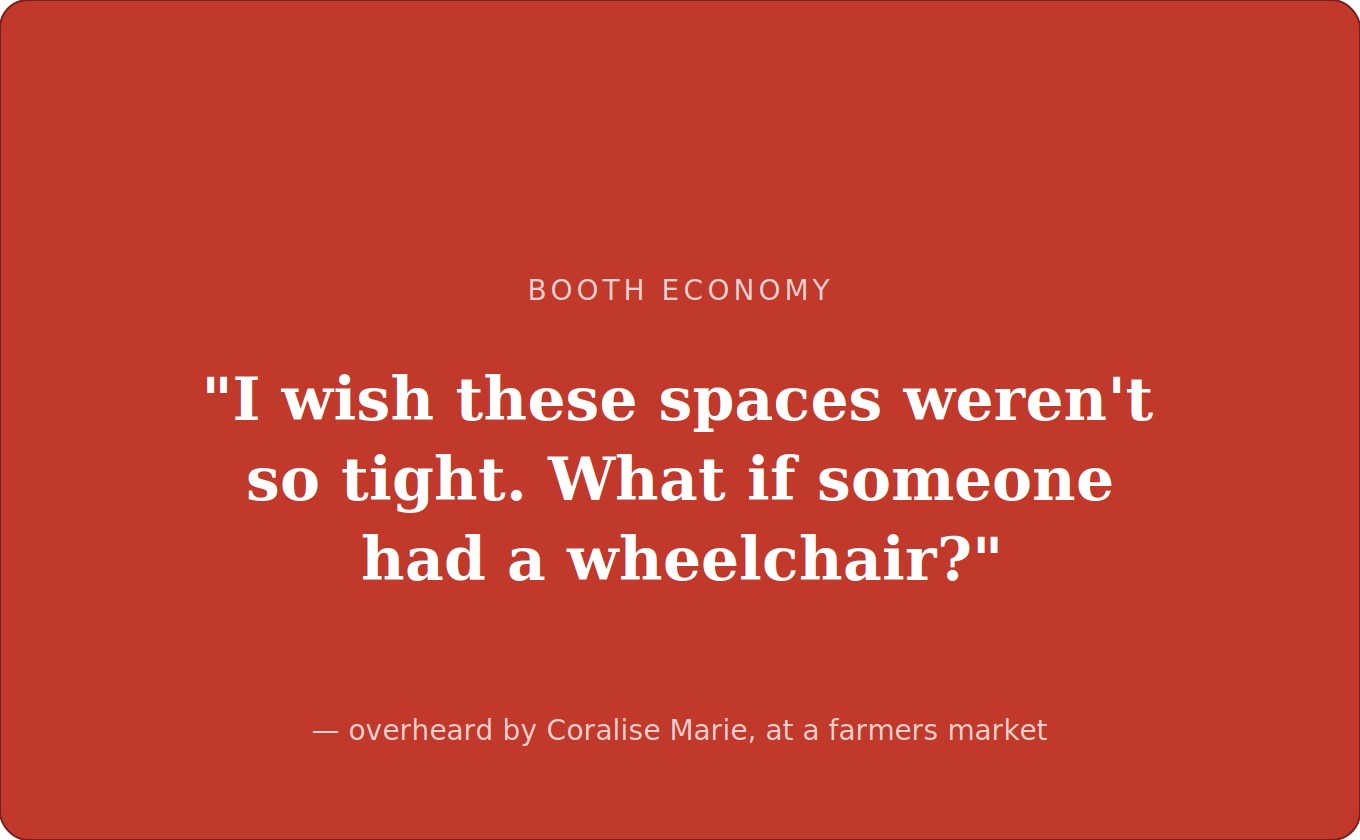
“I wish these spaces weren’t so tight. What if someone had a wheelchair?” — overheard by Coralise Marie, at a farmers market
Marie said she overheard the comment while a customer was trying to move through her booth at one of her farmers markets. “And it clicked,” she said. “Like, oh snap — she’s right.” The realization reframed the whole layout question for her: this was never just about whether a shopper feels drawn in. It’s about whether they can move through the space at all.
She wasn’t the only one to land there. Elsewhere in Rose’s comment thread, another vendor raised a nearly identical concern about the diagrams themselves, pointing out that one of the proposed layouts left only two feet of clearance on each side — not enough room, she noted, for someone using a walker or a scooter to reasonably get through. Two vendors, working from different starting points — one from a live customer interaction, one from doing the math on a sketch — arrived at the same conclusion: the layouts vendors swap online as sales tactics are also, whether anyone planned it that way, accessibility decisions.
Why a Sketch Drew Nearly 300 Comments
On its face, Rose’s post was a simple either/or question, the kind that gets a handful of one-word replies in most groups. Instead it drew a near-300-comment debate that ranged from table-measurement corrections to a genuine, if informal, accessibility audit of four hand-drawn diagrams. That volume of response is its own data point. It suggests booth layout isn’t treated by vendors as a settled question with a right answer, but as a live, ongoing experiment that most people are still actively running — one bump, one passed-by shopper, one overheard comment at a time.
Layout, it turns out, is never just about where the tables go. It’s about who gets to come in.
Layout Basics: A Quick Reference
The four shapes vendors keep coming back to — and what tends to go wrong with each.
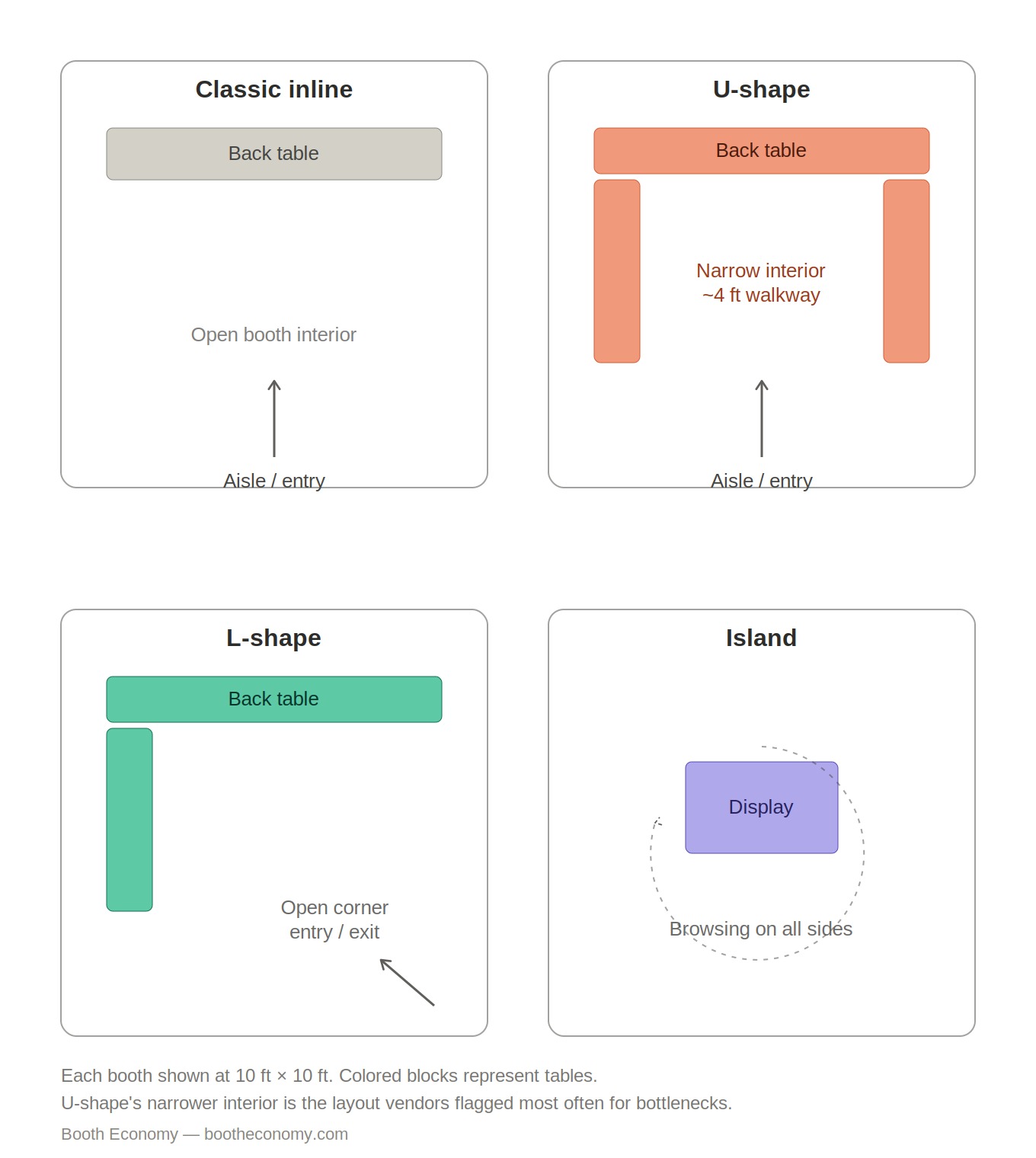
Classic Inline — Tables run along the back wall, with the front left open to the aisle. Simple, predictable, and easy to fit between neighbors on either side. The tradeoff is display space: there’s less surface area to work with than a layout that wraps around.
U-Shape — Tables on three sides, forming an alcove the shopper steps into. Pitched as an “experience” layout, but it’s also the one vendors in this thread struggled with most — narrow walkways inside the U make it easy for two people to collide, and shoppers who hesitate at the opening often just keep walking. The “outer U” variant — seller at the back, shopper-facing side fully open — was the fix several vendors landed on.
L-Shape — Tables along two adjacent sides, leaving the opposite corner open. Works well for corner spots or anywhere you want generous display without boxing shoppers in. This is the shape Coralise Marie defaults to when she has a neighbor on one side.
Island — A freestanding display with open space on all four sides, allowing shoppers to circle it. Needs more total footprint than the other three, but creates the most natural, unforced browsing flow of the bunch.
As a rough rule of thumb, ADA accessible-route guidance for fixed buildings sets a minimum clear path width of 36 inches, narrowing to 32 inches only briefly at things like doorways. Booths at markets and fairs aren’t held to that standard the way a permanent storefront is, but it’s a useful gut check: if a walkway inside your setup is meaningfully narrower than that, you’re not just risking a sale — you’re risking shutting someone out entirely.
Leave a Reply